Case Study · 06 of 06
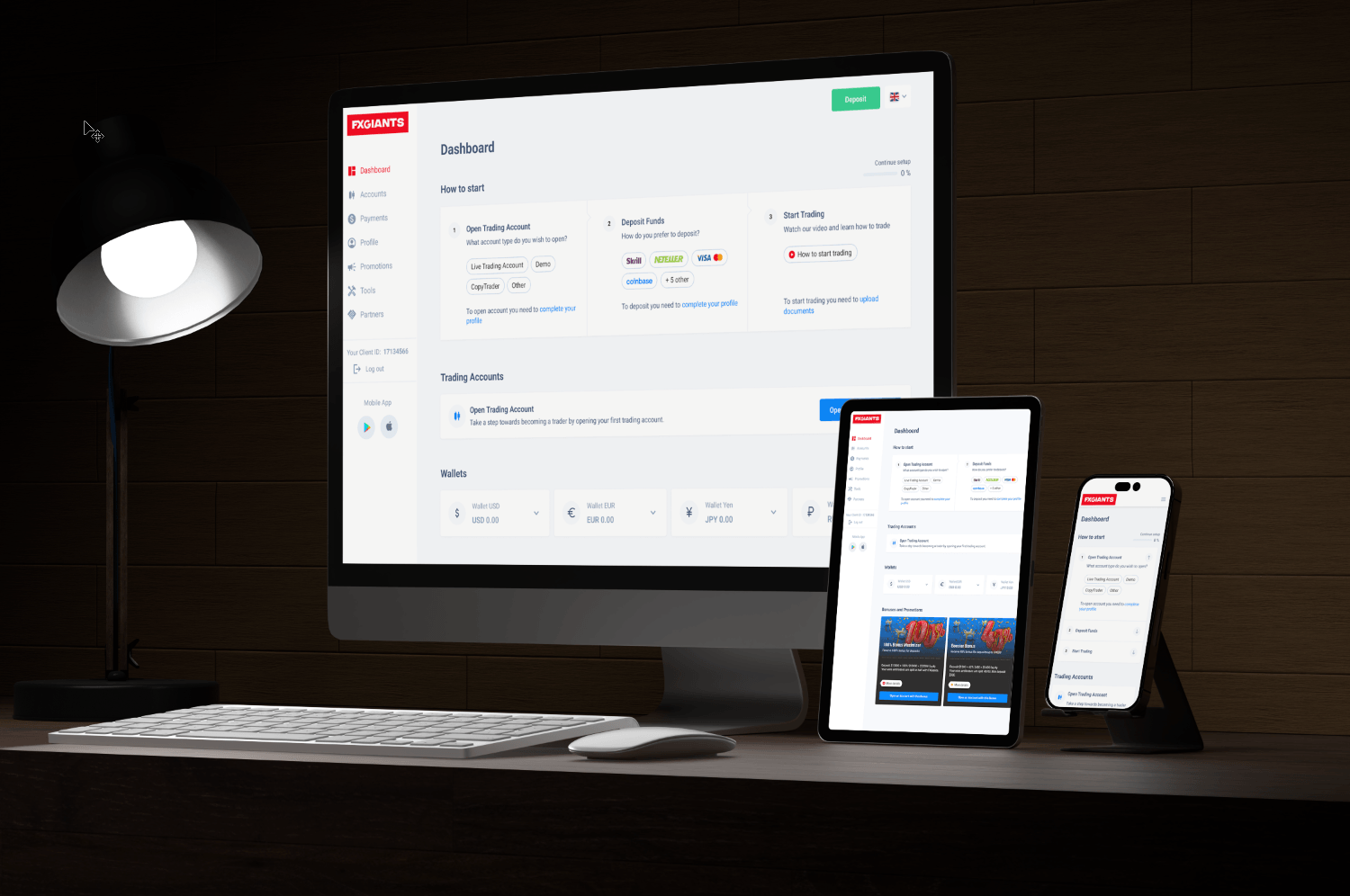
FXGiants: an onboarding dashboard for new retail traders.
A multi-surface trader dashboard designed to walk new clients from sign-up to first trade. Built around the three jobs they actually have to complete: open an account, fund it, start trading — without losing them in between.