Case Study · 02 of 06

iSX Money: a dashboard that turns banking ops into a 3-minute job.

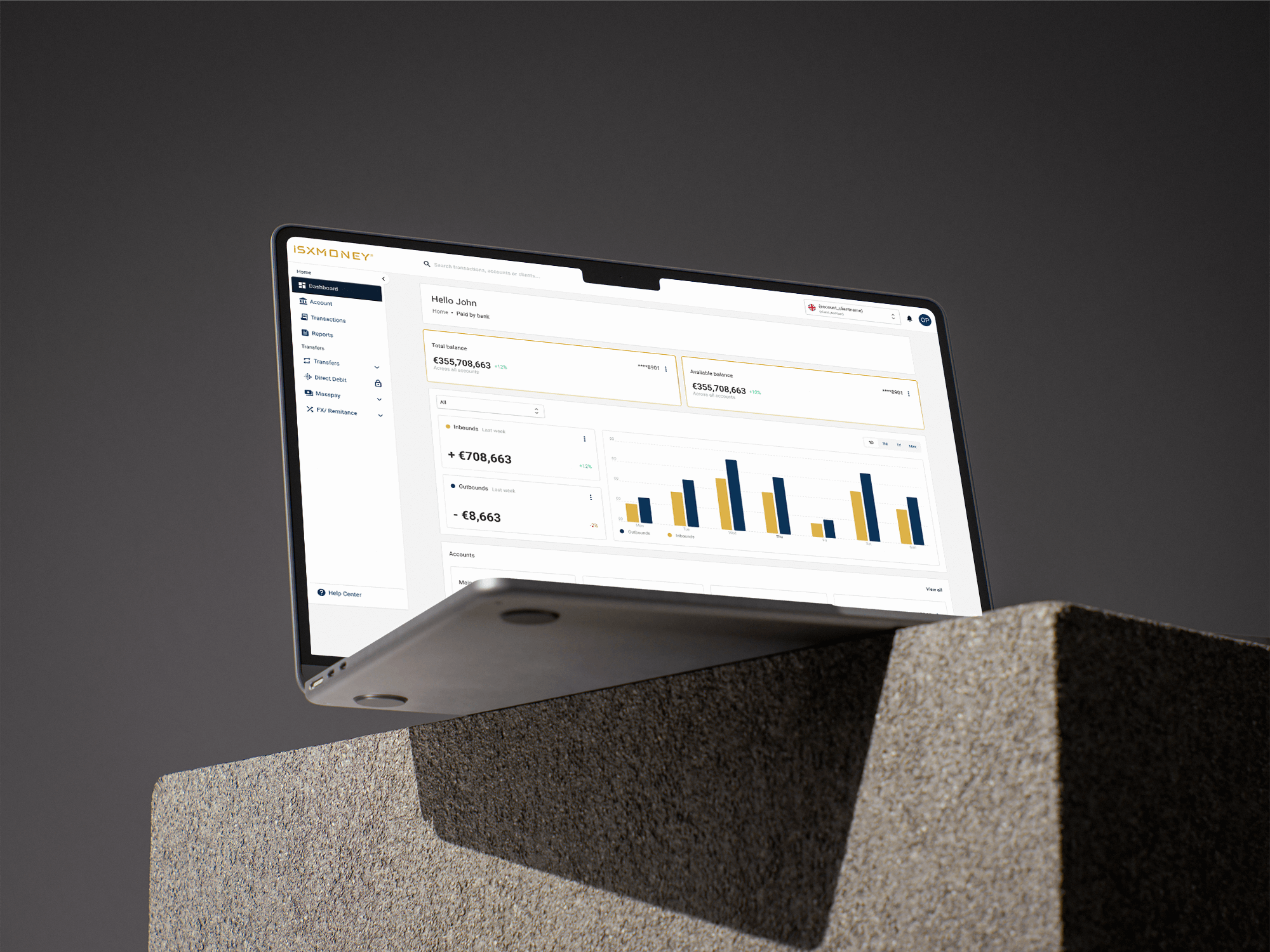
An all-in-one financial operations tool for SMB and corporate clients — consolidating accounts, transfers, direct debits, mass payouts, and FX into a single, calm interface. Designed to replace four tabs with one.

Role
Lead Product Designer
Timeline
11 months · 2022–23
Team
3 designers, 9 engineers, 2 PMs
Platform
Web (desktop-first)
iSX Money dashboard hero shot

One platform, every account, in any currency.

iSX Money serves finance teams who move large volumes through multiple accounts and currencies. They were doing it across four disconnected products — and bouncing between them was costing them hours every week.

I led the design of the unified platform, from information architecture and the component library to the production-ready dashboard. The work covered the home view, accounts, transactions, transfers, direct debit, Masspay (bulk payments), and FX/remittance — each with its own data shape and edge cases.

Four products held together with browser tabs.

Before · Fragmented Tooling

  • Separate logins for accounts, transfers, FX, and Masspay
  • Inconsistent terminology — "Beneficiary" / "Recipient" / "Payee"
  • No unified balance view; users tallied in spreadsheets
  • Manual data entry repeated across products
  • Audit trail scattered across exports and emails

After · Single Source of Truth

  • One login, one nav, one design language
  • Centralized beneficiary book reused across every flow
  • Real-time balance across all accounts & currencies, on the home screen
  • Smart defaults — last-used currency, recent beneficiary, common amounts
  • Unified activity log with filters, exports, and audit-ready receipts

Watching finance teams work.

Most B2B fintech research is interview-only. I pushed for contextual inquiry: sitting with 6 finance teams during their actual end-of-month process. We recorded screens, counted clicks, and timed tasks.

Finding 01

The work happens in spreadsheets, not in our product.

Users exported CSVs from our tool, did the actual thinking in Excel, then re-uploaded results. The dashboard was a courier, not a workspace.

Finding 02

Trust is built one decimal place at a time.

Every user we observed double-checked numbers against a calculator or another tab. Currency formatting, rounding rules, and timestamps mattered enormously.

Finding 03

One person types; another approves.

Almost every meaningful action was a two-person job. The product needed maker-checker built in from the floor up, not bolted on.

Finding 04

Mobile is a glance, not a workflow.

Finance leads checked balances on their phone during meetings, but no one was ever going to set up a 200-row Masspay batch on a 6" screen.

A nav model that matches how money actually moves.

We restructured the IA around roles ("I want to see my money" / "I want to move my money" / "I want to prove what happened") rather than around backend products. The sidebar reads: Dashboard, Account, Transactions, Reports, and then a Transfers group containing Transfers, Direct Debit, Masspay, and FX.

Every transfer flow shares the same skeleton — source, beneficiary, amount, purpose, review, confirm — so muscle memory transfers between them. The data tables share one component, one set of filters, one export pattern.

Patterns that scale

  • Composable data table with sticky headers, column controls, saved views, and row-level actions. One component, six surfaces.
  • Inline maker-checker: every actionable list row shows status, who initiated, who's pending, and a single CTA appropriate to the viewer's role.
  • Currency-aware numerals using tabular figures, with optional small caps for codes (€, USD, GBP). Numbers line up vertically — which sounds trivial and isn't.
  • Bar-chart system for the home screen that supports inbound vs outbound, period comparison, and zero-state messaging without three different components.

Inside the platform.

Faster setup, fewer errors, more volume.

3.4×
Faster transfer setup vs. the previous platform
+42%
Transaction volume per active user, 6 months post-launch
28
Markets supported at launch
-71%
Configuration errors flagged at the review step
"First time I've used a banking dashboard where I could trust the number on the screen without opening the export. The team has stopped checking against Excel." — Head of Finance, mid-market FX client

What this taught me about B2B fintech design.

The product is the data table. In B2B fintech, the table is the canvas. If your table works — fast, filterable, exportable, role-aware — most users will forgive a lot elsewhere.

Onboarding sessions matter as much as launch. We built a 6-week rolling intake program where I sat in on every new-customer kickoff. Each one produced 2–3 fixes that shipped within the next sprint.

Numbers need rules, not just styles. A "currency token" in the design system has to cover formatting, rounding, locale, screen-reader output, and what happens at zero. That's a design system asset, not a Figma component.

Next Case Study · 03 of 06

PaidBy Open Banking →

Account-to-account checkout across 4,000+ banks