Case Study · 01 of 06

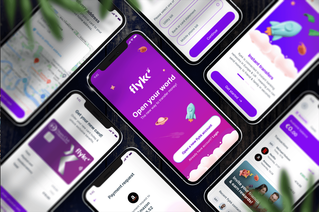
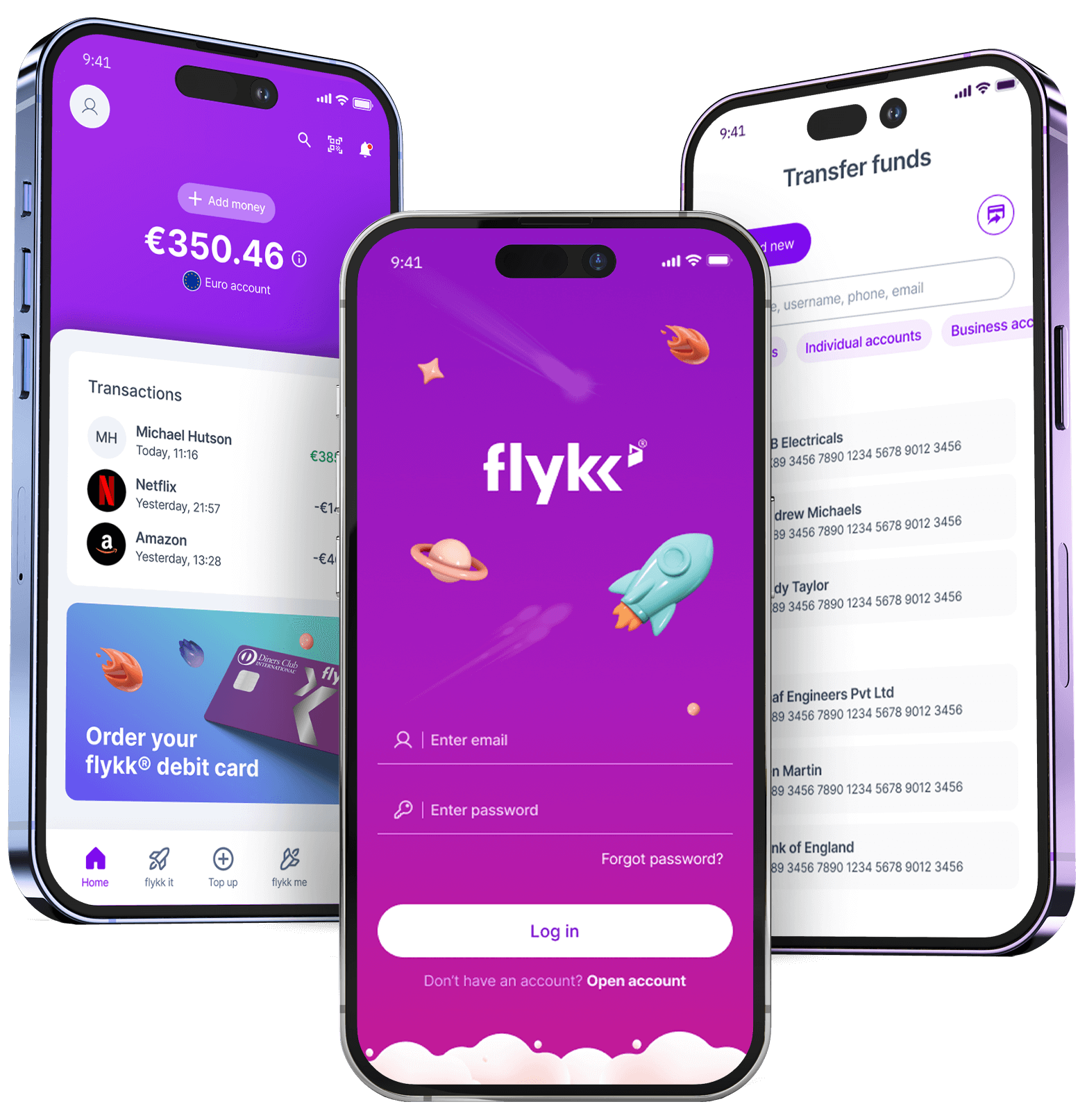
Flykk: a consumer banking app built around financial wellness.

End-to-end design of a mobile-first banking experience covering KYC onboarding, accounts, transfers, cards, and a peer-to-peer rewards system. Designed to make managing money feel calm and confident, not anxious.

Role
Lead Product Designer
Timeline
9 months · 2023–24
Team
2 designers, 6 engineers, 1 PM, Compliance
Platform
iOS · Android · Web onboarding
Flykk mobile app — flat-lay of multiple screens

A banking app that earns trust before it asks for it.

Flykk launched as a challenger to incumbent retail banks. Early traction stalled on a single number: 58% of users abandoned KYC. Acquiring those users had cost real money — losing them at the door was unsustainable.

I joined as Lead Designer to own the product end-to-end. The brief sounded simple — "fix onboarding" — but the underlying problem was structural. The flow had been designed around regulatory checklists, not around the person sitting on the other side of the screen. We rebuilt it from first principles.

Over nine months, my work expanded beyond KYC into the full app: home, accounts, transfers, cards, and a peer-to-peer rewards system that became one of the product's most-loved features.

When compliance and conversion pull in opposite directions.

Every challenger bank has to answer the same question: how do you collect 12+ regulated data points from a new user — name, date of birth, address, government ID, proof of address, source of funds, tax residency — without losing them along the way?

Our existing answer was 14 screens long. Users dropped out at every step. Support was drowning in "stuck on photo upload" tickets. Compliance was unhappy because unclear submissions required hours of manual review.

Before · The State We Inherited

  • 14-step linear flow with no progress indication
  • Regulatory language: "Provide proof of beneficial ownership"
  • Photo capture with no live feedback — users uploaded blurry IDs and waited
  • End-of-form validation: errors only surfaced after the user tapped Continue
  • Single "Help" button buried in the nav, leading to a 40-page FAQ
  • 58% drop-off · 8.2 min average completion · 42 weekly support tickets

After · What We Shipped

  • 4 grouped stages with visible progress and "save & resume" by default
  • Plain language: "We need to see the back of your ID, too"
  • Live camera with edge detection, lighting feedback, and instant re-shoot
  • Inline validation — addresses autocomplete, IDs are checked before submit
  • Contextual help baked into each step, supported by 4 micro-explainers
  • 27% drop-off · 3.4 min average completion · 13 weekly support tickets

Five sources of truth before a single pixel moved.

01

Analytics Audit

Mapped 90 days of funnel data across 11,400 onboarding attempts. Identified the four screens responsible for 71% of drop-offs.

02

Session Replays

Watched 60 abandoned sessions end-to-end. Quietly humbling. Most users tried, then quit — they didn't rage-quit, they got confused.

03

User Interviews

12 sessions with people who'd recently opened (or tried to open) a bank account. Wrote down every moment they paused or asked "why?"

04

Stakeholder Maps

Workshops with Compliance, Fraud, Support, and Engineering. Charted every regulatory requirement and the rationale behind it.

"Honestly? It was done before I expected it to be. A couple of taps, no head-scratching, I was verified and in." — Andreas Papadopoulos, New flykk User

Four findings that reshaped the product.

Insight 01

Users abandon when they don't know why.

The single highest-impact change was adding one sentence of context to every sensitive question. "We ask this because…" reduced drop-off on the source-of-funds step from 34% to 11%.

Insight 02

Real-time validation beats end-of-form errors.

People will retry a single field three times before they'll re-submit a whole form. Inline checks — name format, address autocomplete, ID quality — turned frustration into momentum.

Insight 03

Progress is a feature, not a decoration.

Showing "Step 2 of 4" with grouped sections, not "Page 7 of 14", changed how users described the experience. "Long but fair" instead of "endless".

Insight 04

Trust compounds: every screen either deposits or withdraws.

A polished tone of voice, a single mistake-free submission, a fast response time — these added up. By the time users hit "Open my account", the brand had already earned the click.

Flykk app — three phones showing home, login, and transfer screens

Three principles that guided every screen.

Show the path

Users should always know where they are, how far they've come, and what's next. No surprise screens.

Speak human

Every label, every error, every microcopy moment in the language a user would actually use with a friend.

Catch errors early

Validate on blur, not on submit. Don't ask a user to re-photograph an ID after they've already moved on.

From a regulatory checklist to a guided conversation.

We restructured 14 linear screens into 4 grouped stages: About you, Where you live, Prove it's you, and Almost done. Each stage felt like a chapter, not a checkpoint.

Inside each stage, we introduced progressive disclosure: ask one question confidently, validate it instantly, then move on. We rewrote every label with Compliance and Legal sitting in the room, so the language was both regulator-safe and human-readable on the first pass.

Highlights from the redesigned flow

  • Live ID capture with edge detection, glare warnings, and a one-tap retake — no more "we couldn't read your document" emails 20 minutes later.
  • Address autocomplete wired into a proprietary verification service. Users see their full address appear after typing a postcode — saves them an average of 22 seconds per session.
  • Source-of-funds picker with contextual examples for each option. Instead of "What is your source of funds?", we ask "What is the main way you earn money?"
  • Save & resume by default. A magic-link email lets users finish on a different device, on a different day. Recovers 14% of would-be drop-offs.
  • Trust scaffolding on every step: small reassurances ("We never sell your data", "Used only to confirm it's you") wherever the form felt heavy.

A walkthrough of the redesigned app.

Compliance wasn't the blocker — it was the partner.

The fastest way to fail at a regulated product is to design alone and ask Compliance to bless it at the end. I ran weekly co-design sessions with our MLRO and Legal Counsel from week one. We co-wrote the microcopy.

With Engineering, I scoped the rebuild in three vertical slices so we could ship in stages, measure each one independently, and roll back any slice that didn't move the metric. With Support, we ran a "ticket-to-improvement" loop: every two weeks, the top five new-user complaints fed directly into the design backlog.

I also rebuilt the design system in parallel — extracting form patterns, error states, progress components, and trust elements into reusable building blocks that the rest of the product later inherited.

Leadership Note

The mentorship side of this project was as valuable as the shipped work. I paired with a mid-level designer through the entire engagement; she ran the rewards feature end-to-end and is now a Senior Designer on the team.

Numbers that mattered to the business.

+31%
KYC completion rate, measured over a 12-week post-launch window
-58%
Inbound support tickets related to onboarding
3.4 min
Average time to complete, down from 8.2 min
$2.1M
Estimated annual saving in acquisition-cost recovery

Beyond the headline numbers, the design system seeded by this project is now used across 4 surfaces (mobile, web, admin tools, and the partner portal). CSAT for onboarding rose from 3.2 to 4.5 in the first quarter after launch.

Two patterns introduced here — the "we ask because…" sentence and the live capture component — were adopted by the parent group across three sister products.

What I'd do differently.

I'd test with non-English speakers earlier. Our first usability round was English-only. When we expanded to Greek and Romanian-language users in round two, we found copy patterns that worked in English but broke in translation. That now happens in week one for every regulated flow.

I'd build the design system before, not during. Doing both at once cost us roughly two weeks of friction. On the next project, I scoped a two-sprint "foundations" phase first.

I'd push harder for richer analytics from day one. We had funnel data but no per-field timing. Adding that mid-project gave us our biggest insight (most drop-off happens in the first 15 seconds of a new screen) — it should have been in place from the start.

Next Case Study · 02 of 06

iSX Money Dashboard →

Cross-border money movement for SMB finance teams